Choosing the Perfect Pillow Shade to Complement Your Bedspread and Curtains
Match your pillow shade to your bedspread’s main color for a calm, seamless look, and check how it pairs with your curtain undertones-earthy tones for warm, sage or lavender for cool. Pick fabrics like cotton or sateen for breathability and comfort. Test colors in natural and evening light, since bulbs can shift how shades appear. Go neutral if you want flexibility, and choose removable, washable covers with a trial period. You’ll find more ways to fine-tune your choices ahead.
Notable Insights
- Match pillow color to your bedspread’s dominant hue for a cohesive and calming bedroom aesthetic.
- Use curtain undertones to guide complementary pillow shades, such as sage with cool blue or terracotta with warm red.
- Add contrast pillows in bold tones like navy or ruby red to create focal points against neutral bedding.
- Evaluate pillow color under natural and artificial light to ensure consistency in appearance throughout the day.
- Choose neutral-colored pillows for versatility, making it easy to coordinate with changing bedding or curtains.
Match Your Pillow Color to the Bedspread’s Main Hue
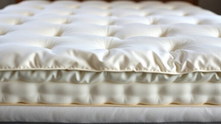
A pillow color that aligns with your bedspread’s dominant shade creates a seamless, restful look that supports a calm sleeping environment. You’ll benefit from color harmony, as matching tones reduce visual clutter and help your mind relax. This subtle coordination matters, especially if you struggle with sleep disorders-consistent, soft surroundings signal safety and routine. Pair this with a fabric texture that feels soothing against your skin, like breathable cotton or smooth sateen, to enhance comfort without irritation. Consider how texture influences both touch and airflow, since overheating can disrupt sleep. When testing pillows, examine not just hue but how light reflects off the material, altering perceived color throughout the day. Many quality pillowcases come with trial periods, so you can assess color harmony and fabric texture in your actual bedroom lighting. Choose wisely-your sleep quality may depend on these quiet, consistent details. For added depth and elegance, consider layering your bedding with a matelassé bedspread to enhance both texture and visual interest.
Use Curtains to Pick Complementary Pillow Colors
Your curtains’ undertones can guide you toward pillow colors that balance the room’s overall mood, especially if you’re sensitive to visual stimulation before bed. Warm red or yellow undertones in your curtains pair well with earthy pillow shades like terracotta or sand, promoting a cozy, inviting color harmony. If your curtains lean cool with blue or gray hints, soft sage or lavender pillows can enhance a calming atmosphere conducive to sleep. Consider fabric texture, too-linen curtains might call for cotton or microfiber pillows to keep the feel consistent and soothing. Matching textures helps maintain visual calm, which is helpful if you struggle with sleep onset. A seamless shift between curtain and pillow tones supports steady relaxation without jarring contrasts. This subtle coordination improves color harmony while letting you adjust lighting and comfort with minimal effort. Test samples in natural light to see how colors shift through the day.
Add a Pop of Contrast Against Your Bedding
Though most of your bedding sticks to neutral tones, slipping in a few pillows with bold contrast can sharpen the room’s visual balance and subtly signal your brain that it’s time to wind down. You can use bold accents to create focal points that guide relaxation without overwhelming your space. Opt for vibrant pairings-like deep navy or ruby red against beige or gray-to add energy while maintaining calm. These contrast pillows don’t need to dominate; just one or two in smooth, breathable fabrics support both comfort and design. Choose inserts with medium firmness for better neck support during sleep. Look for removable, washable covers with a warranty against fading, since bold colors may show wear over time. Testing a sample under home lighting helps verify performance and fit. This small tweak enhances visual depth and may improve bedtime routines by framing rest as intentional.
Check How Light Changes Your Pillow Color
Since lighting shifts throughout the day, it can change how your pillow color looks in your bedroom, so checking this helps you pick a shade that stays true at night. Natural light brings out cool undertones, while artificial light alters appearance based on its color temperature. A warm bulb can make neutrals appear deeper, and daylight-balanced LEDs may highlight fabric sheen, shifting perceived color. Test your pillow in different lights to see how it performs. Choosing light bulbs with a warm color temperature can enhance coziness and ensure your pillow shade complements the bedroom’s relaxing atmosphere.
| Time of Day | Pillow Appearance |
|---|---|
| Morning | Soft, balanced hue under natural light |
| Evening | Richer tone with warm lamping |
| Night | Subtle sheen shows under overhead lights |
Observe how the fabric sheen interacts with room lighting, since smoother textiles reflect more. This affects not just color but room ambiance, which influences relaxation. Choosing a consistent shade across light conditions supports a calm sleep environment without visual distraction.
Go Neutral for Easy Pillow Coordination
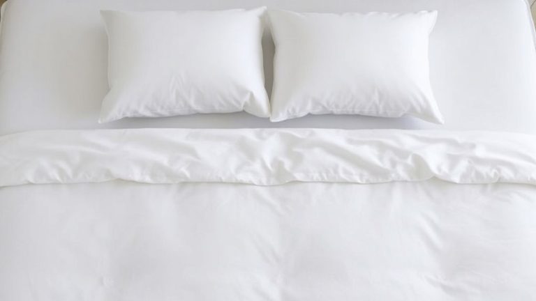
A neutral pillow shade offers flexibility when updating your bedroom, letting you mix and match with sheets, blankets, and décor without clashing. You’ll find neutral pillows simplify long-term coordination, especially if you change your bedspread or curtains seasonally. Opting for beige, gray, or soft white supports fabric harmony across materials like cotton, linen, or microfiber, enhancing overall cohesion. To add subtle interest, introduce texture contrast-pair a smooth satin pillow with a nubby knitted throw or a quilted cotton duvet. This balance keeps the space visually calm without sacrificing tactile variety. Many neutral pillows come with removable, washable covers, aiding hygiene and sleep quality over time. Look for options with trial periods or warranties, especially if considering memory foam or latex fill for support. These features let you test comfort and firmness risk-free, which matters if you have neck or back concerns affecting sleep. For long-term satisfaction, consider the best neutral bedding picks based on material quality and user-tested comfort.
Layer Multiple Pillow Colors for Depth
When you layer multiple pillow colors, you’re not just adding visual depth-you’re creating a sleep environment that balances comfort and design. Try color blocking with two or three shades from your bedspread or curtains to anchor the look. Deeper tones at the back, fading to lighter ones in front, give a pulled-together feel. Add texture pairing using knit, velvet, or linen pillows to enhance visual interest without overwhelming. Mix firm and soft fills to support different sleeping positions-down for cuddlers, memory foam for neck support. Look for removable covers with hidden zippers for easy washing. Most quality brands offer a 30-night trial and a one-year warranty, so you can test comfort and durability. Layering isn’t just stylish-it helps you personalize your sleep zone to match both aesthetic and physical needs, subtly improving rest over time.
On a final note
Choose pillow shades that align with your bedspread’s main color or complement your curtains for cohesion. A pop of contrast adds interest, while neutrals offer flexibility. Test colors in different lighting to see how they shift throughout the day. Layering tones creates depth and texture. Consider removable, washable covers for easy updates. Most quality pillows come with trial periods, so test for comfort and appearance. Match aesthetics with support needs for restful sleep.